Google Calendar Redesign
The Challenge:
Given a week how can we improve the user experience of Google Calendar without removing elements or changing functionality, only changing the size and location of them?
Skills Used:
Sketching
Interviews
Photoshop and Illustrator
Mock-Ups
Duration:
One week project at
Indiana University
My Solution
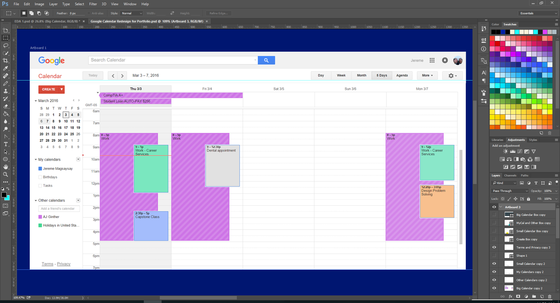
The Old vs. The New
Current calendar design
proposed calendar design
A Closer Look:
Main focus
This allows a user to come to Calendar to do what they came to do, schedule and manage events. Making the focal point the calendar, the interface becomes simplified, letting the users can come to do what they came here for.
Less Clutter
The items that were previously on the left side of the screen, are
now brought below the fold. The goal of this was to make scheduling more efficient, removing the clutter, putting the focus on the main calendar.
Asking Around:
I asked a couple of people who use Google calendar on a regular basis for their input on the design. Through these interviews I found that people said these things about the calendar in its current state:
Translating these quotes into values, I extracted 2 core values my solution speaks to: simplicity and efficiency.
Sketching Some Ideas:
With these values in mind, I explored how to my design could contain these values. Here are some different configurations that I explored while sketching:
Mocking It Up:
Using the values distilled from quotes, it seemed apparent to me that the main calendar was the the most used feature. Scheduling being the main feature of this website, how could it's main feature be brought to the forefront, considering the constraints? Was it already in the forefront? I chose to expand the main calendar so people can do what they came to do: schedule.
My Reflection:
This challenge was hard for me to do because of the constraints. There were (and are) elements that I found extraneous that I would just remove to make a cleaner website. The constraints forced me to think harder about what to do with these elements and the reasoning behind all the placements and changes that were made for the solution that I proposed. This affirmed with me that the having and showing rationale behind what you do is really important because without it, there really is no substance behind why the solution got to this point.


